
CapCut Caption Fonts: 10 Best Options for Readability
Have you ever picked a font in CapCut that looked perfect… but somehow your viewers still couldn’t read your captions?
I’ve been there. You choose something clean, stylish, even on-brand. But once it’s live on TikTok, it falls apart. The text fades into the background. The letters feel too thin. People scroll past without even trying to read.
Here’s the truth most creators miss: choosing CapCut Caption Fonts isn’t about what looks good in the editor. It’s about what survives real-world viewing—small screens, bad lighting, fast scrolling.
And it matters more than you think. If people can’t read your captions, they won’t stay.
So in this guide, I’ll show you the 10 best CapCut Caption Fonts that actually work. The ones that stay clear, bold, and easy to read no matter where your video shows up. Plus, I’ll point out the common font mistakes that quietly kill your engagement.
Are you new to CapCut captions? Here’s a quick step-by-step guide on how to add captions on CapCut before choosing the right CapCut Caption Fonts.
The CapCut Caption Fonts Readability Criteria: What Actually Matters
Before we even talk about the best CapCut Caption Fonts, you need to understand what separates a readable caption from one people ignore.
Because here’s the truth: most font choices don’t fail because they’re ugly… they fail because they can’t survive real viewing conditions.
So let’s break down what actually matters.
The 4 Things That Make or Break Your Captions
1. X-height (Why Some Fonts Stay Clear at Small Sizes)
This is the height of lowercase letters like “a”, “e”, and “x”.
Fonts with a tall x-height stay readable even when your captions are small. Fonts with short lowercase letters? They shrink into nothing.
2. Stroke Contrast (Why “Pretty” Fonts Fail)
This is the difference between thick and thin parts of a letter.
High contrast fonts look beautiful… until compression hits. Then the thin parts disappear.
Low to medium contrast fonts hold their shape better, especially on mobile screens.
3. Letter Spacing (Why Tight Text Becomes a Blur)
When letters are too close, they start to blend together.
It might look clean in the editor, but on a phone screen, it turns into a mess.
A little extra spacing makes every word easier to scan quickly.
4. Distinct Letter Shapes (Why Confusion Kills Retention)
Good fonts make every character easy to tell apart.
Bad ones? “I”, “l”, and “1” all look the same. Same with “O” and “0”.
When viewers have to guess what they’re reading, they don’t stick around.
Where Most CapCut Caption Fonts Break
Even a good-looking font can fail once it leaves your editing screen.
- TikTok compression wipes out fine details
- Instagram Reels’ bright UI makes light text hard to see
- YouTube Shorts has to work across all kinds of devices
- Outdoor viewing demands strong contrast and bold shapes
If your font can’t handle these, it doesn’t matter how nice it looks.
The 10 Best CapCut Caption Fonts
Now that you know what makes a font actually readable, let’s get into the best CapCut Caption Fonts that hold up in real-world conditions.
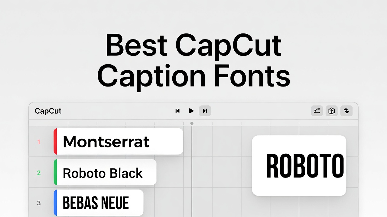
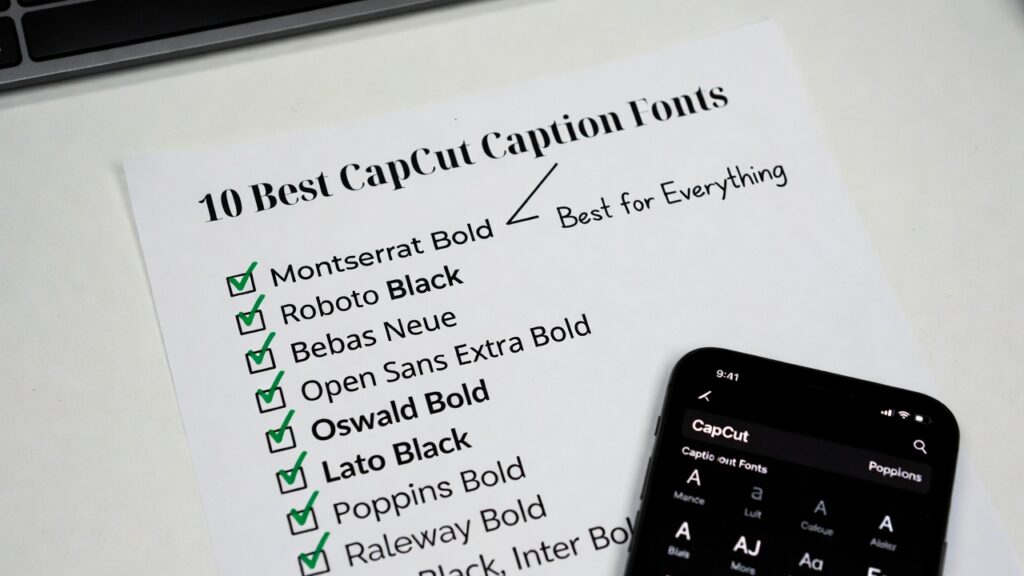
1. Montserrat Bold / Montserrat Black
If you only pick one font, make it this.
Montserrat is clean, bold, and built for screens. It holds up under compression and stays readable in almost any condition.
Best for: Everything — especially educational and professional content
2. Roboto Black
This is the font Android is built on. It’s been tested on billions of screens, and it shows.
It stays clear even at small sizes and fits more words without feeling cramped.
Best for: Tutorials, tech, and mobile-first audiences
3. Bebas Neue
This one demands attention. All caps, bold, and impossible to miss.
But keep it short — long sentences in all caps feel overwhelming fast.
Best for: Hooks, titles, and punchy statements
4. Open Sans Extra Bold
Clean, professional, and easy to read without feeling boring.
It works across different styles of content without clashing.
Best for: Business and coaching content
5. Oswald Bold
Need to fit more words without shrinking your font? This is your guy.
It’s narrower but still readable, which makes it great for longer captions.
Best for: Quotes and full-sentence captions
6. Lato Black
This one feels softer and more human.
It’s still strong, but not as rigid as geometric fonts.
Best for: Lifestyle and personal brand content
7. Poppins Bold
Modern, clean, and visually satisfying.
Its large letter shapes make it very easy to read on mobile.
Best for: Fashion, tech, and design-focused content
8. Raleway Bold / Black
This adds a bit of elegance without losing readability — but only in heavier weights.
Lighter versions will disappear on small screens.
Best for: Aesthetic and luxury-style content
9. Nunito Black
Rounded, friendly, and easy on the eyes.
It works great if you want to feel approachable without looking childish.
Best for: Youth, education, and casual content
10. Inter Bold
This font was built specifically for screens.
Every detail is tuned to stay sharp, even at smaller sizes.
Best for: Tech content and anything detail-heavy
Fonts to Avoid (And Why Most CapCut Caption Fonts Fail)
Not all CapCut Caption Fonts are built for real-world use.
Some look great in the editor… then completely fall apart once your video goes live.
Here are the ones you should avoid — and exactly why they fail.
Never Use These for Captions
Arial / Helvetica (Light or Regular)
These seem “safe,” but they’re actually too thin for mobile screens.
Once your video hits a bright background or gets compressed, the letters start to disappear.
Times New Roman (and All Serif Fonts)
Those little strokes on the edges? They blur fast.
Serif fonts were made for print, not fast-scrolling videos.
They also feel outdated, which can quietly hurt your content.
Script or Cursive Fonts
They look stylish… until someone tries to read them quickly.
Connected letters break under compression, and readability drops hard.
For many viewers, especially non-native readers, this becomes frustrating fast.
Decorative Fonts (Like Creepster, Lobster, etc.)
These fonts have strong personality — but that’s the problem.
They overpower your message and don’t scale well to small caption sizes.
Thin or Light Weights of Any Font
This is where most creators mess up.
Thin fonts look clean in editing… but they vanish in sunlight, blur on export, and get destroyed by compression.
If your viewer has to squint, you’ve already lost them.
Font Pairing Strategies (Keep It Clean, Not Chaotic)
Using multiple CapCut Caption Fonts can make your videos feel more dynamic — or completely messy.
Here’s the simple rule that keeps everything looking professional.
The Safe Pairing Formula
Primary font: One strong, bold caption font
Secondary font: Same family (different weight) or a clean contrast
Pairings That Actually Work
Montserrat Black + Montserrat Light
Clean, consistent, and easy to control
Bebas Neue + Open Sans Bold
Strong hooks with readable supporting text
Roboto Black + Roboto Regular
Great for technical or structured content
Oswald Bold + Lato Black
Works well for longer captions and quotes
The One-Font Rule (When in Doubt)
If you’re unsure, stick to one font family and just change the weight.
It’s simple, clean, and almost always looks better than mixing random fonts.
How to Actually Use CapCut Caption Fonts (Without Messing It Up)
Picking the right font is only half the job. How you use it matters just as much.
Best Caption Sizes by Platform
TikTok: Large and bold (around 80–100px feel)
Instagram Reels: Slightly smaller but still clear (75–90px)
YouTube Shorts: Play it safe (70–85px for wider compatibility)
Your goal is simple: someone should read it at arm’s length without trying.
CapCut Size Rules That Actually Work
Think in screen space, not numbers.
Single words: about 80% of screen width
Short phrases: 60–70%
Never go past 90% — it starts to feel cramped
Shadow and Stroke (This Is Non-Negotiable)
If you skip this, even the best CapCut Caption Fonts can fail.
Shadow option:
Black, high opacity, slight offset, minimal blur
Stroke option:
Black outline, thick enough to separate text from background
If your background is chaotic, add a soft dark box behind the text.
Font-Specific Tweaks
Montserrat: Clean already, light shadow is enough
Bebas Neue: Needs stronger outline to stand out
Oswald: Be careful with shadows — it can get crowded
Raleway: Needs extra definition to survive compression
Test Your Fonts Before You Commit
Don’t guess. Test.
This is how you know if your CapCut Caption Fonts actually work.
The 3-Test Method
1. Distance Test
Hold your phone at arm’s length.
If you can’t read instantly, your font is too small or too thin.
2. Sunlight Test
Check your video outside.
If the text disappears, you need more contrast or a heavier font.
3. Scroll Test
Scroll past your video like you would on TikTok.
If the captions don’t catch your eye, they’re not strong enough.
The Compression Test (Most People Skip This)
Export your video. Then import it again and export one more time.
This mimics what platforms do to your content.
If your text breaks here, it will definitely break on TikTok or Instagram.
Brand Consistency vs. Platform Optimization
So here’s the big question: should you use the same CapCut Caption Fonts everywhere… or adjust for each platform?
The answer isn’t as simple as “pick one.”
The Case for Consistency
Using the same font across your videos builds recognition.
Over time, people start to recognize your content instantly — even before they read a word.
That’s powerful.
The Case for Optimization
But here’s the reality… every platform behaves differently.
TikTok compresses harder. Instagram has brighter UI. YouTube runs on a wider range of devices.
If you ignore that, even great CapCut Caption Fonts can underperform.
The Smart Middle Ground
You don’t have to choose one or the other.
Pick one strong font family — like Montserrat, Roboto, or Open Sans — and adjust how you use it.
TikTok: Go heavier, bigger, and stronger shadows
Instagram: Slightly lighter weight can work, focus on clean visuals
YouTube: Stay balanced, aim for maximum readability across devices
This way, you stay consistent without sacrificing performance.
Final Thoughts
Here’s the part most people get wrong.
Choosing CapCut Caption Fonts feels like a design decision… but it’s really a performance decision.
The font that looks the best in your editor is often the one that fails once your video goes live.
So keep it simple.
Start with something proven like Montserrat Bold or Roboto Black.
Then adjust when needed — Bebas Neue for impact, Oswald when space is tight, Lato when you want a softer feel.
But never trade readability for style.
If people can’t read your captions, nothing else matters.
Test your videos in real conditions. Watch them the way your audience does. Fix what breaks.
Because at the end of the day, the best captions aren’t the ones that look good…
They’re the ones people actually read.