
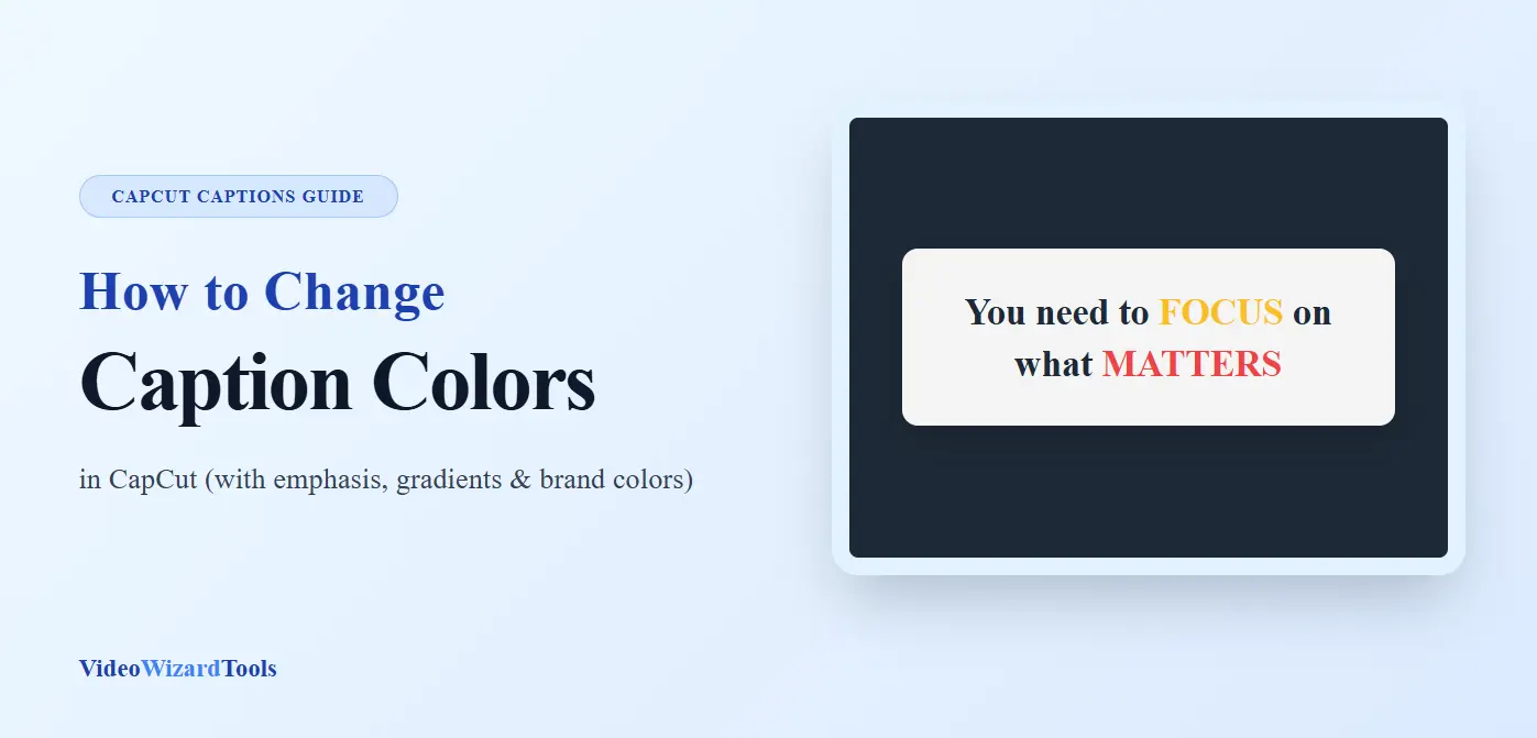
You want your captions to do more than just display text. You want them to emphasize, guide attention, and brand your content.
Color is the fastest way to signal importance: keywords in bright yellow, questions in curious cyan, calls-to-action in urgent red.
But CapCut’s default caption styling is monochrome, and the color change tools are buried or behave unexpectedly when applied to auto captions versus manual text.
The challenge isn’t just applying color, it’s applying it strategically. Random rainbow text looks amateur.
Thoughtful color hierarchy transforms viewer understanding. And technical constraints matter.
Certain color combinations fail under platform compression, gradient effects render differently on mobile versus desktop, and animation timing must sync with color changes for professional results.
In this guide, you’ll learn how to Change Caption Colors in CapCut with basic color application steps, the highlight techniques that emphasize specific words, gradient and multi-color effects, brand color consistency, and platform-specific optimization that ensures your colors survive compression and display correctly across devices.
Understanding CapCut’s Color Systems
CapCut has multiple color tools that behave differently. Know which to use when.
Color Tool 1: Text Color (Basic)
- Applies uniform color to the entire text layer
- Works on both auto captions and manual text
- Simple, reliable, limited to a single color
Color Tool 2: Text Style/Highlight (Advanced)
- Applies background highlight to text
- Can be solid color or gradient
- Works on manual text; limited on auto captions
Color Tool 3: Animation Color Change (Dynamic)
- Changes color during animation
- Requires keyframing or specific animation presets
- Complex but powerful for emphasis
Color Tool 4: Layer Effects/Color Correction (Global)
- Applies to the entire layer, including text
- Tint, temperature, hue shift
- Affects text and background together
The auto caption limitation: Batch Edit allows uniform color changes to all auto captions. Individual word color changes require converting to manual captions or using workaround techniques.
Now lets move to how you can change Caption colors in CapCut.
Method 1: Basic Caption Color in CapCut (Uniform Application)
The foundation: apply a single color to an entire caption or caption set.
Step-by-step guide for Auto Captions:
1. Generate Auto captions
- Run the auto caption tool and let CapCut create your text.
- Before styling, quickly fix any spelling or timing errors.
2. Enter Batch Edit
- Tap the caption track on your timeline.
- Then select Batch Edit to edit all captions at once.
3. Apply color
- On CapCut mobile, click on Style (on the next menu that appears, click again on the Styles option just beside the Fonts option. For CapCut desktop, look at the far right and click on basic, then scroll down.
- Pick a color from the palette or enter a Hex code for precision.
4. Verify contrast
- Check against light and dark video sections
- Ensure readability throughout
Step-by-Step: Manual Text
1. Select or create a text layer
- Tap your text on the timeline to open editing.
2. Change the color
- Go to Style → Text (or Text Color).
- Choose a preset or enter your custom Hex code.
3. Improve contrast (important)
Flat text can disappear on busy backgrounds. Fix that with:
- Shadow: Use black (#000000) for reliable contrast
- Stroke: 2–4px to keep text readable everywhere
This small step makes a huge difference in real videos.
For CapCut beginners, learn how to add captions in CapCut (both Auto & Manual methods) first.
Method 2: The Emphasis Word Technique (Selective Color)
Change color for specific words to create an emphasis hierarchy.
The challenge: Auto captions don’t support individual word coloring. Manual text requires separate layers per color.
Solution A: Manual Layer Separation (Most Control)
1. Identify emphasis words
- Script analysis: which words carry emotional or informational weight?
- Typically: verbs, adjectives, key nouns, calls-to-action
2. Create separate text layers
- Base text: “You need to”
- Emphasis layer 1: “FOCUS” (different color, larger size)
- Base text continued: “on what matters.”
3. Time precisely
- The emphasis layer appears simultaneously with the spoken word
- Slight scale animation (90% → 100%) on the emphasis word
- Color contrast: base white, emphasis bright color
Solution B: The Fake Highlight (Auto Caption Workaround)
1. Generate auto captions normally
- Complete all editing
2. Duplicate project for emphasis
- Save a copy, we’ll modify specific captions
3. Convert emphasis captions to manual
- Delete specific auto caption block
- Add manual text at the same time
- Apply a different color
4. Maintain consistency
- Most captions remain auto (uniform color)
- Key moments are manual (emphasis color)
If you’re frequently converting auto captions to manual just for selective color emphasis, consider starting with a prepared script from the beginning. This approach lets you build layered, color-differentiated text with full control and avoids auto-caption limitations entirely.
Method 3: The Karaoke-Style Color Fill (Progressive Highlight)
Words change color progressively as they’re spoken, the classic karaoke effect, adapted perfectly for emphasis and dynamic captions. Here is the technique i recommend:
1. Create duplicate text layers
- Layer 1 (bottom): “Full sentence here” in gray or muted color
- Layer 2 (top): Same text in bright color
2. Mask the top layer
- Initially, the top layer is fully masked (invisible)
- As the word is spoken, the mask reveals that word only
3. Animate mask position
- Keyframe mask to reveal words left-to-right
- Synchronize with speech timing
Simplified mobile version:
1. Split into word layers
- Each word separate layer
- Word 1: Bright color
- Words 2-6: Gray color
- Duplicate, shift colors as the sequence progresses
For even more precise word-by-word color reveals synced to speech (especially useful in karaoke-style or lyric videos), see the dedicated guide on creating CapCut karaoke captions.
2. Sequence timing
- Word 1 bright at 0:00
- Word 2 bright at 0:05 (Word 1 fades gray)
- Continue pattern
Visual effect: “Filling in” color creates a visual progress indicator, emphasizes the current word, and maintains the context of the full phrase.
Method 4: Gradient and Multi-Color Effects
Single colors are safe. Gradients add dimension but require careful execution.
Gradient types:
Linear gradient (text fill):
- Style > Gradient > Linear
- Angle: 90° (top-to-bottom) or 0° (left-to-right)
- Color stops: 2-3 colors maximum (more looks chaotic)
Recommended gradients:
| Style | Color 1 | Color 2 | Use Case |
|---|---|---|---|
| Sunset | #FF6B6B (coral) | #FFE66D (yellow) | Warm, energetic |
| Ocean | #4ECDC4 (teal) | #556270 (slate) | Cool, professional |
| Neon | #FF00FF (magenta) | #00FFFF (cyan) | High energy, gaming |
| Gold | #FFD700 (gold) | #FF8C00 (orange) | Premium, luxury |
Gradient application:
On manual text:
- Direct gradient fill available
- Adjust the angle to match the video lighting if possible
On auto captions:
- Limited gradient support
- Convert to manual or use solid colors
The shadow requirement: Gradients reduce perceived contrast. Increase shadow weight:
- Shadow opacity: 90-100%
- Shadow offset: 4-6px
- Shadow blur: 4-6px
Method 5: Brand Color Consistency
For business accounts, color is brand identity. Random colors dilute recognition.
The brand color workflow:
1. Identify brand colors
- Primary: Main brand color (appears 60% of the time)
- Secondary: Accent color (30% of time)
- Tertiary: Highlight/emergency (10% of time)
2. Create CapCut color presets
- Enter hex codes exactly
- Save as favorites if the CapCut version supports it
- Or maintain a note with hex codes for reference
3. Apply systematically
| Content Type | Color | Example |
|---|---|---|
| Standard narration | Primary brand color | White (#FFFFFF) |
| Key statistics | Secondary accent | Brand blue (#0066CC) |
| Call-to-action | Tertiary highlight | Brand orange (#FF6600) |
| Warnings/cautions | Emergency color | Red (#FF0000) |
4. Document and share
- Create a brand guidelines document
- Include CapCut-specific settings
- Ensure team consistency
Method 6: Platform-Specific Color Optimization
Colors render differently across platforms. Optimize for where you publish.
TikTok color strategy:
Compression survival:
- TikTok’s aggressive compression destroys subtle colors
- Avoid pastels, light grays, subtle gradients
- Use saturated, bold colors that survive 2-3 encoding passes
Trending color psychology:
- Yellow: Optimism, attention (highest performing TikTok color)
- Cyan: Trust, technology (strong for educational content)
- Red: Urgency, emotion (use sparingly for impact)
- White with heavy shadow: Universal readability
The yellow advantage: TikTok’s interface is dark. Yellow (#FFDD00 or #FFE135) pops against dark backgrounds and white video content. Most visible color in fast-scrolling feed.
Instagram Reels color strategy:
Aesthetic alignment:
- Reels audience expects more curated color palettes
- Match video color grading (warm video = warm caption tints)
- Gradients more acceptable than TikTok
Color space consideration:
- Reels processing shifts reds and magentas
- Test upload: if skin tones look wrong, caption colors shifted too
- Adjust source: slightly desaturate reds before upload
YouTube Shorts color strategy:
Device diversity:
- Shorts plays on everything: phones, tablets, TVs, and desktops
- Maximum contrast essential (white/black) for TV viewing
- Avoid colors that fail colorblind tests (red/green combinations)
Accessibility priority:
- Color shouldn’t be the sole information carrier
- “Important” words need size or weight change, not just color
Color Psychology for Caption Impact
Colors carry meaning. Use intentionally.
| Color | Meaning & Association | Best Used For |
|---|---|---|
| Red | Urgency, passion, danger | Warnings, strong calls-to-action, excitement |
| Blue | Trust, calm, stability | Educational content, professional videos |
| Green | Growth, success, positivity | Tutorials, positive outcomes, “go” signals |
| Yellow | Energy, optimism, attention | Hooks, highlights, quick emphasis |
| Orange | Friendly, action-oriented | CTAs, sales content, approachable branding |
| Purple | Creative, premium, mysterious | Artistic edits, luxury-style content |
| Pink | Playful, youthful, emotional | Fun content, youth-focused videos |
| Black | Sophisticated, bold, final | Contrast text, luxury tone, endings |
| White | Clean, simple, neutral | Default captions, universal readability |
The Color combination rule:
Never rely on color alone. Pair with:
- Size change (emphasis words larger)
- Weight change (bold for important)
- Position change (center for key moments)
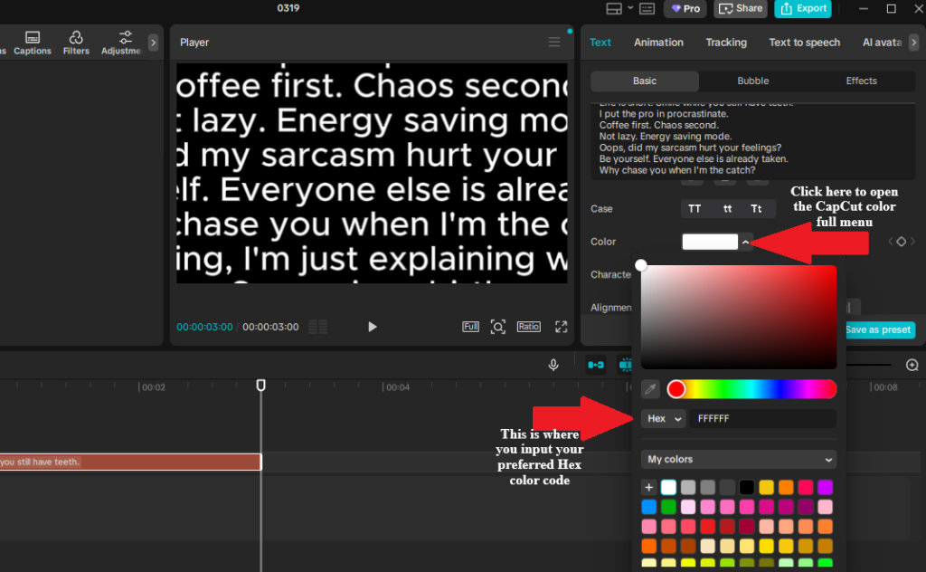
Technical Color Implementation on CapCut
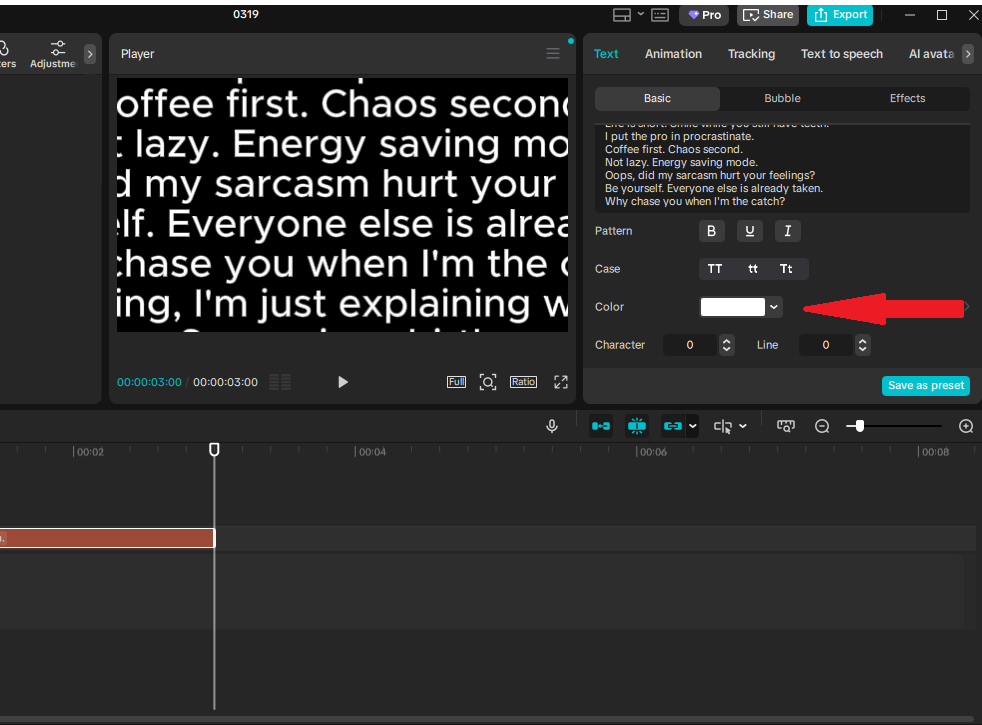
This screenshot shows the Caption editing panel in CapCut, where you customize colors. The red arrows point to:
- The color menu toggle (opens the full picker)
- The Hex code input field (for exact brand-matching colors)
Using Hex codes ensures perfect consistency and readability across your videos, no more guessing with sliders!
How to Enter a Hex Color Code in CapCut
(Works for both manual text and auto captions — select your text/caption layer first on the timeline.)
On Mobile (Android/iOS App)
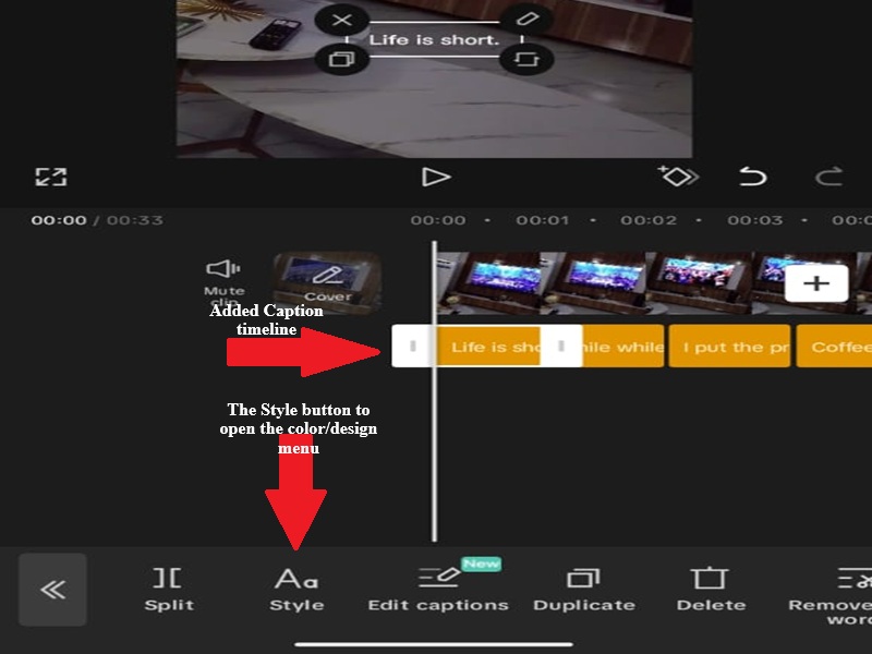
The interface is compact, with tools at the bottom of the screen.
- Select your text or caption block on the timeline (tap it to highlight).
- In the bottom toolbar, tap the Style tab (as shown in the image above).
- Tap the Styles button beside Fonts in the menu that appears, this will bring up the color settings and other designing menu (see the screenshot below).
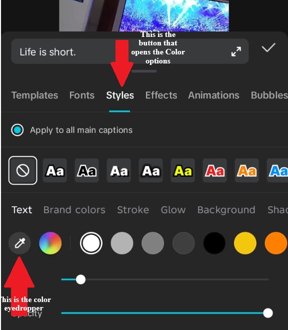
- This opens the color picker:
- Swipe through presets or use the wheel/sliders for quick picks.
- For precise Hex: Look for the Hex field, tap it, type/paste your 6-digit code (e.g., #FF0000 for bright red), and hit enter/apply.
- Alternative: Use the eyedropper to sample from your video frame (it lets you instantly select and match a color directly from any part of your video frame, image, or canvas preview).
On Desktop/PC (Windows/Mac Version)
- Select your text or caption clip on the timeline (click it).
- On the right panel, go to the Basic or Style tab (usually first or under Text settings).
- Find and click Color (or “Fill”/”Text Color” — it opens a full color window).
- In the color picker window:
- Choose from swatches, wheel, or sliders.
- For exact Hex: Enter your 6-digit code directly in the Hex input field (labeled #RRGGBB or similar — paste it in and press Enter). It’s always visible here, no hidden menus.
- Bonus: Desktop often has a color history or eyedropper tool right in the panel for sampling.
💡 Pro Tip: Hex is best for brand colors (e.g., #FFD700 for gold highlights). The picker works great for quick matches from your footage.
Common Useful Color Codes (Copy-paste ready for captions/highlights):
- Bright Yellow (keyword pop): #FFFF00 or #FFEA00
- Urgent Red (CTAs): #FF0000 or #FF2D55
- Curious Cyan: #00FFFF or #00D4FF
- Clean White: #FFFFFF
- Muted Gray (base for progressive reveal): #808080
- Brand Gold: #FFD700
| Color Name | Hex Code | RGB |
|---|---|---|
| Pure White | #FFFFFF | 255, 255, 255 |
| Off-White | #F5F5F5 | 245, 245, 245 |
| Pure Black | #000000 | 0, 0, 0 |
| Soft Black | #1A1A1A | 26, 26, 26 |
| TikTok Yellow | #FFE135 | 255, 225, 53 |
| Instagram Cyan | #00D2FF | 0, 210, 255 |
| YouTube Red | #FF0000 | 255, 0, 0 |
| Safe Blue | #0066CC | 0, 102, 204 |
| Accessible Green | #228B22 | 34, 139, 34 |
The shadow color formula
For captions and text overlays in CapCut (especially on mobile or dynamic video backgrounds), shadows boost contrast and make words pop without overwhelming the viewer.
But poor shadow choices can reduce readability. Here’s are recommended formula most creators use:
- Primary recommendation: Use black (#000000) at 80–100% opacity. This creates a clean, dark drop shadow that works universally — it lifts white/light text off dark backgrounds and grounds dark text on light/bright ones.
- Alternative for subtle/natural looks: A very dark complementary color to your text (e.g., deep gray #1A1A1A or near-black navy if text is warm-toned). Sample it with the eyedropper from a muted area of your video for seamless blending. Keep opacity 70–90% and blur higher (5–10) to soften edges.
- Avoid at all costs: Colored shadows (e.g., red shadow on yellow text, blue on cyan, etc.) They often clash, reduce contrast, and make text harder to read, especially on small phone screens or fast-scrolling Reels/TikToks.
Quick CapCut Settings for Pro Readability
- Select your text/caption on the timeline.
- Tap Styles (bottom toolbar on mobile) or go to Basic/Style panel (PC).
- Enable Shadow.
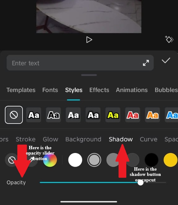
- Set:
- Color: Black (#000000) or very dark gray.
- Opacity: 80–100% (start at 85% and preview).
- Blur: 4–8 (soft but defined).
- Distance: 3–10 (depending on text size).
- Angle: 45° or -45° (natural light direction).
- Preview on full screen, tweak until text stands out clearly against your footage.
This matters in videos because busy backgrounds wash out flat text.
A strong black shadow acts like an “outline” without the harshness of stroke, ensuring your strategic colors (yellow keywords, red CTAs) stay readable and engaging.
Common Color Mistakes
Mistake 1: Color without contrast
- Light blue text on light blue background
- Fix: Test against all video sections. Minimum contrast ratio 4.5:1.
Mistake 2: Too many colors
- Rainbow captions, every word different
- Fix: Maximum 3 colors per video: primary, secondary, accent.
Mistake 3: Ignoring colorblind accessibility
- Red/green combinations (10% male population can’t distinguish)
- Fix: Add size/weight differences, not just color.
Mistake 4: Trend over brand
- Using trending colors that clash with the brand identity
- Fix: Adapt trends within brand palette, or skip trend.
Mistake 5: Compression blindness
- Subtle pastels that disappear on TikTok
- Fix: Saturate 20% more than looks “right” in the editor.
Advanced: Animated Color Change (Keyframed Text)
This technique lets your caption color change dynamically while the text is on screen — perfect for emphasis and retention.
How to do it (Desktop)
- Select your text layer
- Move the playhead to the start (Set your initial color, e.g., white)
- Move the playhead forward on the timeline
→ Change the text color (e.g., yellow)
→ A new keyframe is created automatically - Move the playhead again
→ Change to another color (or revert to the original)
CapCut will smoothly interpolate between these keyframes to create a natural color transition
Real Use Case (What actually works)
- Sentence appears in white
- Important word shifts to yellow as it’s spoken
- Text returns to white after emphasis
This mimics “word highlighting” used in high-retention captions
Timing Rule (VERY Important)
- Ideal transition duration: 0.3 – 0.6 seconds
- This matches standard caption animation timing used in CapCut edits
Why this matters:
- Too fast, it feels like a glitch
- Too slow, it feels laggy and unnatural
Pro Tip (What Most People Miss)
- Space your keyframes slightly apart for smoother transitions
- If the change feels too fast, increase the distance between keyframes
- If it feels slow, move them closer together
Always remember: Smooth color changes = better readability + stronger emphasis
Change Caption Colors in CapCut FAQs
How do I change caption colors in CapCut?
Select your caption or text layer, open the Style or Basic text settings, then choose a new text color from the color picker. On desktop, the color controls are usually in the right-side text panel. On mobile, they are usually inside the bottom text styling menu.
Can I change the color of only one word in CapCut captions?
Yes, but it usually works best with manual text layers. Auto captions often apply styling to the whole caption block, so for one-word color highlights, create a separate text layer for the word you want to emphasize and place it over the original caption.
Can I use hex color codes in CapCut?
Yes, CapCut may allow hex color input depending on your device and app version. Hex codes are useful when you want exact brand colors, such as #FFFFFF for white, #FFE135 for yellow, or a custom brand color.
What is the best caption color for TikTok, Reels, and Shorts?
White text with a black shadow is the safest default because it stays readable on most backgrounds. For emphasis, bright yellow, cyan, red, or orange can work well, but use accent colors only for key words so the captions do not look messy.
Why are my CapCut caption colors hard to read after upload?
Caption colors can become harder to read after upload because TikTok, Instagram, and YouTube compress videos. Light colors, soft pastels, thin fonts, and weak shadows can disappear. Use bold fonts, strong contrast, and a black shadow or outline for better readability.
Should I use gradients for CapCut captions?
Gradients can look good, but they are easier to overdo. Use simple two-color gradients and always add a strong shadow or outline. For fast short-form videos, solid colors are usually safer and easier to read.
How many colors should I use in one caption style?
Use no more than two or three colors in one video: one main caption color, one highlight color, and one optional call-to-action color. Too many colors can make captions look random and harder to follow.
Can I animate caption color changes in CapCut?
Yes, especially on desktop. You can use keyframes to change text color over time, such as white to yellow and back to white. Keep the color change short, around 0.3 to 0.6 seconds, so it feels intentional instead of glitchy.
Final Thoughts
Color in captions is functional, not decorative. It guides attention, signals hierarchy, reinforces brand, and ensures accessibility.
The technical implementation in CapCut—whether simple uniform application or complex animated changes—serves these strategic purposes.
Start with high-contrast basics (white text, black shadow). Add color intentionally for emphasis, not arbitrarily for decoration.
Test on target platforms, where compression and display variations alter your careful choices.
Master color, and you add a communication layer beyond words. Viewers absorb meaning from hue before they finish reading text. That’s the power of strategic color application.