

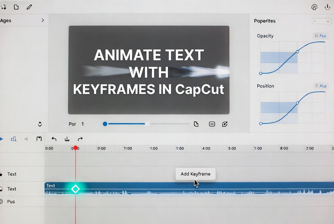
Have you ever added text to your video… and it just sits there doing nothing?
No movement. No attention. People scroll right past it.
I’ve been there. It doesn’t matter how good your message is, if your text feels dead, viewers won’t even read it.
Here’s the good news. You don’t need fancy plugins or advanced software to fix it. CapCut’s keyframes can turn plain text into something people actually notice.
Once you understand how to control things like opacity, position, scale, and color, you can create clean fades, smooth motion, and eye-catching effects that feel professional.
In this guide, I’ll walk you through 6 text animation techniques, from simple fades to motion tracking with exact steps for mobile and desktop, plus timing tricks that make your text look right, not distracting.
Table of Contents
How to Animate Text with Keyframes in CapCut Like a Pro
Animating text in CapCut isn’t just about making words move, it’s about guiding the viewer’s eye, emphasizing your message, and adding professional polish without overcomplicating your edits.
Once you understand keyframes, you can control opacity, position, scale, and color to create text animations that feel smooth, dynamic, and readable.
Below are six essential text animation techniques, ranging from simple fades to advanced motion tracking. For each one, you’ll get:
- Step-by-step instructions for iPhone, Android, Windows, and Mac
- Timing rules to keep your text readable and professional
- Pro tips and common mistakes so you don’t waste time fixing issues later
Master these techniques, and you’ll be able to:
- Make static text feel alive
- Keep viewers engaged longer
- Build signature text animations that match your style
Now let’s start with the first technique: Fade In.
1. Fade In (Opacity Keyframes)
Best for: Lower thirds, name titles, subtle introductions. Mimics broadcast standards for a professional look.
Concept: Opacity goes from 0% → 100% over 0.8–1.2 seconds. Clean and subtle.
Mobile (iPhone/Android)
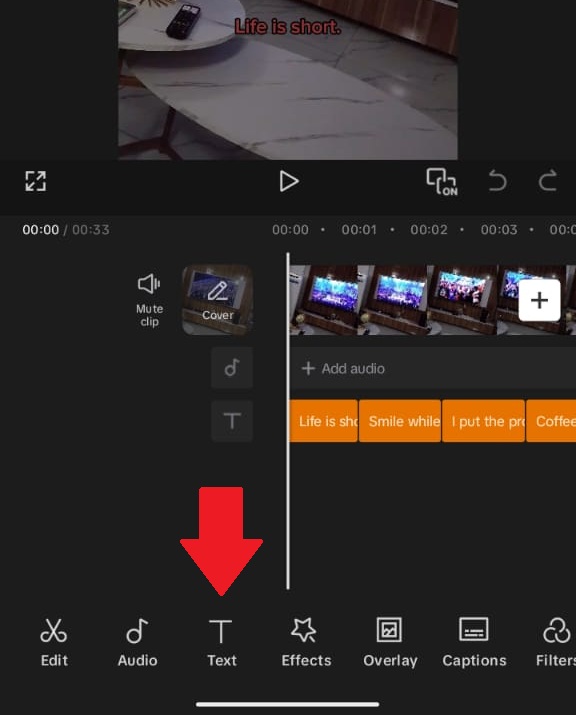
- Tap Text → Add Text → Type your text
- Style first (font, color, size). Changing style after keyframes can break them.
- Position text at its final location.
- Move the playhead 0.8 seconds before text should appear.
- Select the text layer → tap the Keyframe (diamond) button.
- Open Opacity → set to 0%.
- Move playhead to where text is fully visible → tap Keyframe again.
- Set Opacity to 100%.
Desktop (Windows/Mac)
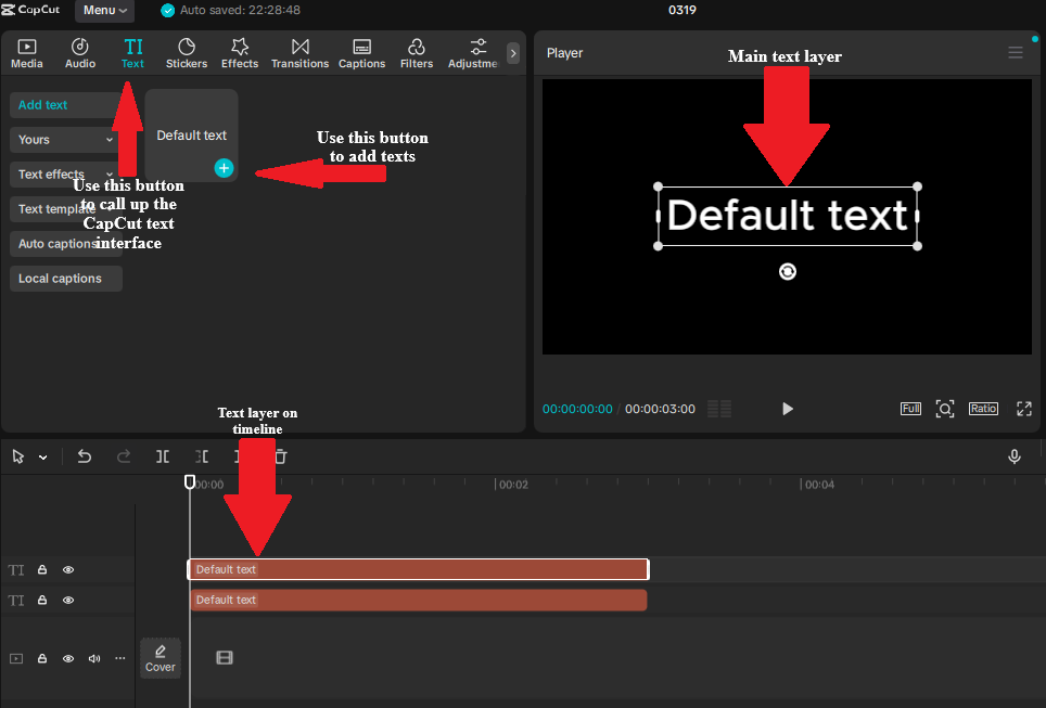
- Add and style text, position final location.
- Click text layer → right panel → Opacity → diamond icon.
- Set Opacity 0%, move playhead forward 0.8s.
- Change Opacity to 100% (second keyframe auto-creates).
Timing rule: 0.8s minimum (60fps → 48 frames; 30fps → 24 frames). Faster feels accidental, slower feels sluggish.
Pro tip: Add a 0.1s hold at 0% opacity before fading in for anticipation.
2. Slide Up (Position + Opacity)
Best for: Main titles, chapter headers, “big reveal” moments.
Concept: Text rises from below the frame while fading in. Combines position + opacity.
Steps (Mobile/Desktop)
- Add text, style it, position it ~20% below final position.
- Set starting keyframe: Position low + Opacity 0%.
- Move playhead 1s forward.
- Set ending keyframe: Position correct + Opacity 100%.
Mobile tip: Pinch to zoom in preview for precise placement.
Desktop tip: Hold Shift while dragging to constrain vertical movement.
Timing rule: 1.0–1.2s for position; opacity can finish slightly earlier (~0.8s).
Common failure: Text slides too far. Keep vertical movement to 10–20% of screen height.
3. Typewriter Effect (Manual Character Reveals)
Best for: Quotes, dramatic statements, tutorial instructions.
Concept: Simulates typing using multiple text clips with keyframed opacity.
Steps
- Type full text (e.g., “Subscribe now”).
- Duplicate text layer for each character or word.
- Reveal characters progressively using opacity keyframes (0% → 100%).
- Stagger timing: 0.1s per character is natural. Adjust for speed.
- Optional: add keyboard click sound effects.
- Efficiency tip: animate word-by-word for long sentences.
4. Scale Pop (Emphasis Animation)
Best for: Call-to-actions, price reveals, important numbers.
Concept: Text scales from 0–100% (or 80–100%) with a slight overshoot, mimicking natural bounce.
Standard Pop
- Keyframe 1: Scale 0%, Opacity 0%
- Keyframe 2 (0.6s later): Scale 100%, Opacity 100%
Elastic Pop (Desktop)
- Keyframe 1: Scale 0%
- Keyframe 2 (0.4s): Scale 110%
- Keyframe 3 (0.6s): Scale 100%
- Use curve editor: Ease Out on keyframe 2, Ease In on keyframe 3.
Mobile workaround: Space keyframes unevenly to mimic easing. Total duration 0.6–0.8s.
Pro tip: Combine with Saturation keyframes (0% → 100%) for extra punch.
5. Color Shift (Temperature & Tint)
Best for: Mood transitions, flashback indicators, brand color reveals.
Concept: Animate text color or temperature to guide emotion.
Examples
- Temperature shift: +30 (warm) → -30 (cool) over 2s
- Saturation reveal: -100 (grayscale) → 0 (full color) over 1.5s
Desktop advantage: Keyframe Hue, Saturation, Lightness separately for complex effects. Mobile only allows global adjustments.
Timing: 1.5–2.5s. Faster feels glitchy; slower loses attention.
6. Kinetic Tracking (Text Follows Motion)
Best for: Sports highlights, moving products, dynamic vlogs.
Concept: Manual motion tracking with Position keyframes every 5–20 frames.
Steps
- Identify track point on moving object.
- Place text near track point.
- Set initial position keyframe.
- Advance 10 frames (adjust per speed) → reposition text → auto keyframe.
- Repeat for duration. Use denser keyframes for fast movement.
- Mobile tip: hold keyframes when object pauses.
- Desktop tip: use motion path handles for precision curves.
Limitation: CapCut has no automatic tracking; use After Effects or DaVinci Resolve for complex motion.
Text Keyframe Timing Reference
Use this as a quick reference to make sure your animations feel smooth, readable, and professional.
| Animation Style | Duration & Keyframe Gap | Feel |
|---|---|---|
| Fade In | 0.8–1.2s / 24–36 frames | Subtle, professional |
| Slide Up | 1.0–1.2s / 30–36 frames | Dynamic, readable |
| Typewriter | 0.1s per character / 3 frames | Engaging, rhythmic |
| Scale Pop | 0.6–0.8s / 18–24 frames | Energetic, punchy |
| Color Shift | 1.5–2.5s / 45–75 frames | Emotional, cinematic |
| Kinetic Tracking | Varies / 5–20 frames | Technical, immersive |
Common Text Keyframe Failures and How to Fix Them
Even experienced editors sometimes run into issues when animating text.
This table highlights the most common problems, why they happen, and the exact steps to fix them—so your animations stay smooth and professional.
If your animation still refuses to behave properly, these CapCut keyframes not working fixes will help.
| Symptom | Cause | Fix |
|---|---|---|
| Text disappears mid-animation | Accidental opacity keyframe at 0% | Check all opacity keyframes; delete stray ones |
| Text slides in wrong direction | Position keyframes reversed | Swap keyframe order or drag text to correct side |
| Animation snaps, doesn’t slide | Keyframes too close together | Space keyframes 15+ frames apart minimum |
| Text blurry after scaling | Scaling low-resolution text too much | Start with larger text size and scale down instead of up |
| Color change affects whole clip | Adjustment applied to video, not text layer | Color change affects the whole clip |
CapCut Mobile vs Desktop: Text Animation Features
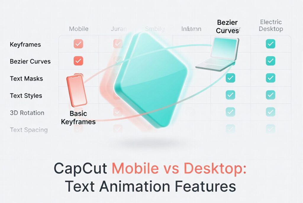
CapCut’s text animation features differ slightly between mobile and desktop. Use this comparison to know which features are available where and how to optimize your workflow.
If you’re still deciding which setup suits your workflow, see our full guide on CapCut on phone vs on laptop.
| Feature | Mobile | Desktop |
|---|---|---|
| Position Keyframes | ✅ Pinch to move | ✅ Pixel-precision drag |
| Opacity Keyframes | ✅ Basic slider | ✅ 0–100% precise input |
| Scale Keyframes | ✅ Pinch to resize | ✅ Numerical entry |
| Color/Temperature Keyframes | ✅ Global only | ✅ HSL curves individually |
| Motion Path Visibility | ❌ No | ✅ Blue line with handles |
| Easing Curves | ✅ Basic presets | ✅ Custom Bezier editor |
| Multi-select Keyframes | ❌ No | ✅ Cmd/Ctrl + click |
Workflow recommendation: Rough in text animations on mobile for speed, then export to CapCut Cloud and open on desktop for precision easing and advanced color curves.
Frequently Asked Questions About CapCut Text Animation
How do I animate text with keyframes in CapCut?
To animate text with keyframes in CapCut, add your text layer, move the playhead to where the animation should start, tap or click the diamond keyframe button, then adjust a property like position, scale, or opacity. Move the playhead forward and change the property again. CapCut will animate the text between both keyframes.
Why are my text keyframes not working in CapCut?
Text keyframes may not work if the wrong layer is selected, the playhead is outside the text layer, you only added one keyframe, or both keyframes have the same value. Select the text layer directly, add at least two keyframes, and make sure the position, scale, opacity, or other value changes between them.
How do I create a typewriter text effect in CapCut?
You can use CapCut’s built-in typewriter animation if it is available in your version. For more control, duplicate the text layer by character or word, then reveal each one with opacity keyframes. A timing of about 0.1 seconds per character can create a natural typing feel.
Can I make text follow a moving object in CapCut?
Yes, but you usually need to do it manually with position keyframes. Place the text near the object, add a position keyframe, move forward a few frames, reposition the text, and repeat until the text follows the movement. For fast motion, use more keyframes closer together.
How do I make text fade in and out smoothly in CapCut?
For a fade-in, set the first opacity keyframe to 0%, move the playhead about 0.8 to 1.2 seconds forward, then set opacity to 100%. For a fade-out, do the opposite: start at 100% opacity and end at 0% opacity.
What is the difference between CapCut mobile and desktop for text animation?
CapCut mobile is good for quick text animation using basic position, scale, and opacity keyframes. CapCut Desktop gives you more precision, easier timeline control, visible motion paths, and better easing options, which makes it stronger for polished text animation.
How do I create smooth text slide animations in CapCut?
Start with the text slightly below or outside its final position, add a keyframe, then move the playhead forward about one second and place the text where you want it to end. For a cleaner result, combine the slide with opacity, starting at 0% and ending at 100%.
How do I make text pop with keyframes in CapCut?
To create a pop effect, set the first keyframe with the text scaled down, then move forward about 0.6 seconds and increase the scale to 100%. For a bounce effect, add a middle keyframe slightly above 100%, then bring it back down to 100%.
Why does my CapCut text look blurry after scaling?
Text can look blurry when you scale it up too much from a small size. Start with a larger text size and scale down instead of making tiny text bigger. Also export at a high enough resolution, such as 1080p or higher, to keep the final text sharp.
Conclusion
Text keyframe animation turns static text into motion that guides viewers’ attention and makes your edits feel professional.
Start with simple fade-ins for a polished look, add slide-ups for energy, use scale pops for emphasis, and advance to kinetic tracking for dynamic, high-production effects.
The same select → set → move → modify → preview workflow underpins every technique. Once you internalize the rhythm, animating text becomes faster and more intuitive than typing it.
To build a strong foundation, make sure you understand how keyframes work across text, video, and audio—and how to troubleshoot them when things go wrong.
Next steps: Pick one technique and create a 5-second test clip. Focus on mastering the timing, then experiment by layering combinations—fade + slide, pop + color shift—to develop your own signature text animation style that viewers instantly recognize.
