
CapCut Captions for TikTok: Best Settings & Positioning

Ever noticed how some TikTok captions instantly grab your attention… while others barely register?
I used to think captions were just “nice to have.”
Add them, pick a font, and done. But once I started tweaking the settings and positioning in CapCut, the difference was obvious — better watch time, more engagement, and fewer people scrolling past.
Here’s the thing: TikTok doesn’t behave like other platforms. People scroll fast, the screen is crowded, and you’ve got seconds to be seen.
That’s why generic caption settings don’t cut it.
In this guide, I’ll show you exactly how to set up your CapCut Captions for TikTok videos. You will understand positioning that avoids UI clutter and settings that make your text impossible to ignore.
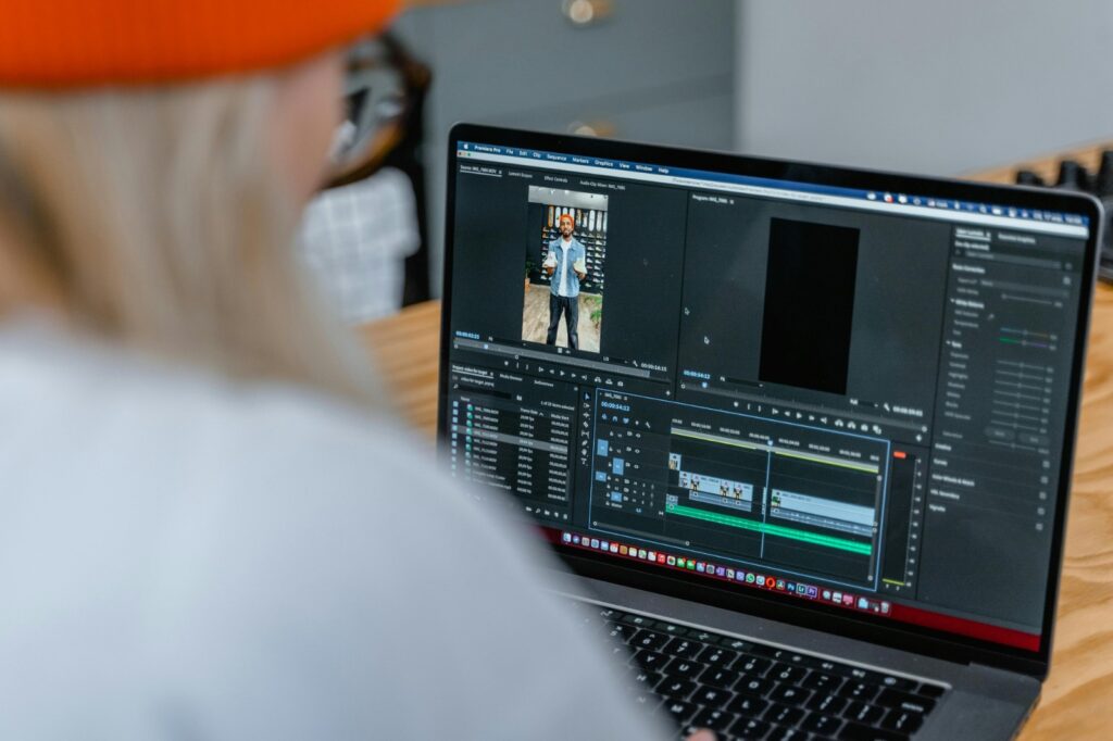
If you’re new to captions in CapCut, check out our full step-by-step guide on how to add captions on CapCut (Auto & Manual) first. It covers everything from setup to syncing, so you’ll be ready to apply these TikTok-specific settings with confidence.
Understanding TikTok’s Interface (Where Your Captions Should Actually Go)
Before you touch fonts or styling, you need to understand one thing — TikTok’s screen is crowded.
If your captions overlap with buttons, usernames, or the progress bar, your video instantly feels messy and harder to watch.
Good captions aren’t just readable. They’re placed where nothing competes with them.
The Safe Zone Rule
Keep your captions inside this area:
Vertical: Middle 70% of the screen
Horizontal: Middle 80% of the screen
This keeps your text clear of TikTok’s UI — especially the bottom caption area and right-side buttons.
Best Placement That Works Right Now
Place your captions slightly above the center.
Sweet spot: 55–60% height, centered horizontally
If your text wraps into two lines, keep it balanced and centered — not drifting too high or too low.
Best CapCut Captions for TikTok Settings (Quick Setup)
If you want something that works across most videos, start here.
Quick Setup
Position: 55–60% height, centered
Font: Montserrat Bold or Black
Text Color: White
Shadow: Black, strong enough to separate from the background
Size: Big enough to read at arm’s length
Line Length: 3–6 words per line, max 2 lines
Animation: Fade or Slide Up (fast and subtle)
This setup is simple, but it works consistently.
TikTok Caption Timing (How to Match the Scroll)
TikTok moves fast. Your captions need to match that speed.
The First 3 Seconds Matter Most
This is where people decide to stay or scroll.
Your first caption should appear almost instantly — don’t wait for audio.
Text should lead, not follow.
Timing That Feels Natural
First 3 seconds: Fast changes to create energy
Normal speech: Match how people talk, not too slow
Fast content: Shorter captions, quicker cuts
Educational content: Slightly longer, but still under control
If captions stay too long, people stop reading. If they move too fast, people miss them.
You’re aiming for that balance where reading feels effortless.
Styling That Works on TikTok (Without Overdoing It)
Here’s where most people go wrong — they try to make captions “look cool.”
On TikTok, simple wins.
Font Choice
Stick to clean, bold fonts that are easy to read instantly.
Avoid anything thin, cursive, or overly decorative.
Size and Weight
Always go bold.
If someone has to squint, it’s already a problem.
Color and Contrast
White text with a strong black shadow works almost everywhere.
Use accent colors only when you want to highlight key words — not entire sentences.
If your text disappears on any part of your video, fix it before posting.
Animations (Keep Them Under Control)
Animations should support your message, not distract from it.
Quick, subtle motion works best.
If the animation is more noticeable than the text, it’s too much.
Adjusting Position Based on Content Type
The default position works most of the time — but not always.
Talking videos: Slightly above center
Product shots: Move captions to avoid blocking the product
Educational content: Slightly higher to fit more text
Screen recordings: Test around UI elements
Your goal is simple: never block what people came to watch.
Sound, Context, and Accessibility
Not everyone watches with sound.
Your captions should still make sense on their own.
Make Captions Work Without Audio
Let your text carry meaning, not just repeat words.
Add Context When Needed
Small details like sound cues or emphasis can make your content clearer.
But don’t overdo it — clarity always comes first.
Use Keywords Naturally
TikTok reads your on-screen text.
If you say key phrases in your captions, your content becomes easier to discover.
Platform-Specific Considerations
Even if your focus is TikTok, you might post the same video to Instagram Reels or YouTube Shorts. Vertical videos have similar safe zones, but each platform has slightly different UI and compression behavior.
- Instagram Reels: Slightly smaller captions may be needed due to UI placement.
- YouTube Shorts: Check captions on multiple devices — they can get cropped on certain phones.
- Adjust your font size, positioning, and timing to maintain readability across platforms.
So take note of this.
Caption Testing & Analytics
Before you finalize captions, test them in real-world conditions to ensure maximum readability and engagement.
- Arm’s-length check: Can you read the captions without leaning in?
- Outdoor/sunlight test: Are captions visible in bright light?
- Fast-scroll simulation: Play the video quickly to see if captions register instantly.
- Metrics to track: Watch time, retention, engagement, and completion rates.
Advanced TikTok Caption Tips
Once you’ve mastered placement, timing, and readability, these expert strategies will take your captions from “good” to truly scroll-stopping.
Each tip focuses on grabbing attention, improving retention, and making your content accessible.
- Highlight Keywords: Draw attention to the most important words or phrases. Bold text or subtle accent colors (like yellow or cyan) make key points pop without overwhelming the viewer. Pro Tip: Only highlight 1–2 words per caption. Overusing color or emphasis dilutes impact and looks messy.
- Hooks in Text: Start captions with phrases that stop the scroll. Examples include “Wait for it…”, “You won’t believe…”, or “POV: …”. Why it works: TikTok users scroll fast — an engaging hook instantly signals value and keeps viewers watching.
- Sync Captions with Audio: Align caption changes with beats, voice cues, or sound effects. Proper syncing makes your content feel dynamic and professional. Implementation: Listen for key moments in your audio and time captions to appear right as something happens — like a beat drop, punchline, or action on screen.
- Accessibility Enhancements: Make your content readable for everyone, including viewers watching without sound or those with hearing difficulties.
- Speaker labels: Use ALL CAPS + colon. Example: SARAH: I never thought I’d say this…
- Sound cues: Include brackets for important sounds. Example: [music stops], [door creaks]
- Emphasis formatting: Use ALL CAPS or accent markers to indicate shouting, whispering, or sarcasm. Example: “I CAN’T BELIEVE THIS” or [whispering]
Using these advanced techniques makes captions more engaging, improves watch time, and ensures that all viewers with or without sound understand your content.
They don’t just look professional, they guide attention and keep viewers hooked.
Common Caption Mistakes That Kill Engagement
Even small mistakes in captions can drastically reduce watch time and engagement. Here’s a detailed breakdown of the most frequent errors and how to fix them:
- Bad Placement: Captions that overlap TikTok UI elements like the username, caption area, sound icon, or progress bar immediately feel messy and hard to read.
Fix: Keep captions within the middle 70% vertical safe zone and middle 80% horizontal width. Slightly above center (55–60% height) usually works best.
Always preview captions on both iOS and Android devices. - Too Much Text: Long sentences or crowded lines overwhelm viewers and make captions impossible to read at a glance.
Fix: Stick to 3–6 words per line and no more than 2 lines per caption.
Break up longer phrases into multiple caption blocks timed appropriately. - Slow Timing: If captions linger too long, TikTok users scroll past before reading. If they change too quickly, viewers can’t follow. Both reduce engagement.
Fix: Follow timing guidelines: first caption within 0.3s, at least 2 changes in the first 3 seconds, max 1.5–2s per caption depending on pace. Sync captions with speech or hook moments for natural rhythm. - Low Contrast: Captions that blend into the background whether bright, busy, or dim areas disappear on screen, especially on mobile devices or in sunlight.
Fix: Use high-contrast text like white (#FFFFFF) with a strong black shadow. Test captions on multiple backgrounds to ensure readability in all scenes. - Too Many Effects: Overusing animations, color changes, or fancy fonts can distract from the message. Viewers focus on the effects instead of reading your captions. Fix: Keep animations subtle and under 20% of the caption duration.
Stick to clean fonts (Montserrat Bold/Black, Roboto Black) and minimal color accents for emphasis only.
If your captions start flickering or behaving unpredictably after adding effects, here’s how to fix glitching or flickering captions in CapCut step by step.
Fixing these common mistakes instantly makes your captions feel professional and easier to read, which directly improves retention and engagement.
Clear, concise, well-placed captions aren’t just aesthetic — they guide the viewer’s attention and ensure your message lands in the split-second scroll culture of TikTok.
TikTok Caption Export Checklist
Before you hit publish, make sure your captions are ready to perform. Use this quick checklist to avoid common mistakes:
- Position: 55–60% height, horizontally centered, clear of bottom 15% and right-side buttons
- Timing: First caption appears within 0.3s, 2+ changes in the first 3 seconds, max 2s per caption
- Style: Bold font (Montserrat or Roboto), white text, black shadow, readable at arm’s length
- Animation: Subtle, under 20% of caption duration, never distracting
- Contrast: Works on bright and dark areas of your video
- Technical: 1080×1920 resolution, 9:16 aspect ratio, 30fps
Frequently Asked Questions
How do I get good captions in CapCut?
Use auto captions for speed, then edit manually for accuracy. Keep captions short (3–6 words), use bold fonts, and position them in the center for better visibility.
If you prefer full control from the start, here’s how to add captions to CapCut directly from a script for faster, more accurate results.
What captions get more views on TikTok?
Captions that are short, bold, and easy to read perform best. Hooks, all-caps phrases, and dynamic word-by-word captions grab attention and increase watch time.
What is the best subtitle style for TikTok?
The best style uses bold fonts, high contrast colors (white/yellow with black shadow), and centered positioning. Animated captions also help keep viewers engaged.
What captions go viral on TikTok?
Viral captions use strong hooks, emotional triggers, and fast pacing. Short phrases, storytelling captions, and emphasis words in all caps tend to perform best.
Where should captions be placed on TikTok videos?
Place captions in the center or slightly above center to avoid UI elements like captions, buttons, and usernames. This ensures they stay visible across all devices.
How do I get the best quality from CapCut to TikTok?
Export your video in 1080×1920 resolution with high bitrate and 30–60 FPS. Avoid excessive compression to maintain caption clarity and sharpness on TikTok.
How many words should TikTok captions have?
Keep captions between 3 to 6 words per line. Short captions are easier to read quickly and help viewers stay engaged throughout the video.
Do captions increase watch time on TikTok?
Yes, captions significantly improve watch time because many users watch videos without sound. Clear, engaging captions help retain attention and boost completion rates.
How can I make captions more engaging in CapCut?
Use animations, highlight key words with color, sync captions to speech, and vary styles throughout the video. This keeps viewers visually engaged and improves retention.
Final Thoughts
Captions aren’t optional anymore — they’re a key factor in whether someone stops scrolling or swipes past.
When captions are clear, well-timed, and positioned correctly, your content becomes instantly easier to watch. That small improvement can make a huge difference in retention.
Stick to the fundamentals:
- Keep captions in the safe zone (55–60% height)
- Keep text short and fast
- Use bold fonts with strong contrast
- Follow a consistent rhythm with timing and animation
Do this right, and your captions don’t just support your video — they help it perform.